Consider a binary classifier that classifies each input pattern in a data set into two classes, either positive (P') or negative (N'), while the ground truth is either positive (P) or negative (N). The performance of the classifier can be represented in terms of these four possible classification results:
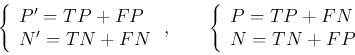
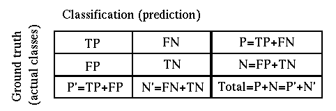
The four cases of the classification result can be represented by the following 2 by 2 confusion matrix (contingency table):
Based on these concepts, we can further define the following performance measurements (all in percentage between 0 and 1):
The
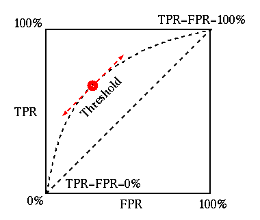
receiver operating characteristic (ROC)
is the plot of TPR (sensitivity) versus FPR (1-specificity).
The classification result in terms of the TPR and RPR corresponds to a point
in the ROC plot. As the best (perfect) classification have ![]() and
and ![]() (i.e.,
(i.e., ![]() ), it corresponds to the point at the top-left corner for 100%
TPR and 0% FPR, while the worst corresponds to the lower-right corner for
), it corresponds to the point at the top-left corner for 100%
TPR and 0% FPR, while the worst corresponds to the lower-right corner for
![]() and
and ![]() . A random guess (by 50% 50% chance) corresponds the
diagonal of the plot. All points above/below the diagonal indicate better/worse
results than a random guess. The ROC can be used to compare the performances of
different classifiers.
. A random guess (by 50% 50% chance) corresponds the
diagonal of the plot. All points above/below the diagonal indicate better/worse
results than a random guess. The ROC can be used to compare the performances of
different classifiers.
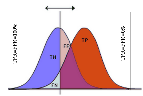
A classifier produces a value to indicate the likelihood of any given input
to be either positive or negative. If this value is greater than pre-set
thresholded ![]() (a parameter for the classifier), then the prediction is positive
(P'), otherwise it is negative (N'). The performance of a classifier can be
represented by an ROC plot of TPR vs FPR, for a set of different threshold
values of T. In particular, we have
(a parameter for the classifier), then the prediction is positive
(P'), otherwise it is negative (N'). The performance of a classifier can be
represented by an ROC plot of TPR vs FPR, for a set of different threshold
values of T. In particular, we have
As a lower/higher threshold ![]() will cause both
will cause both ![]() and
and ![]() to become
higher/lower, the ROC plot is a curve that monotonically increases. The ROC
plot of a good classifier should reach to the top edge for
to become
higher/lower, the ROC plot is a curve that monotonically increases. The ROC
plot of a good classifier should reach to the top edge for ![]() very quickly
as
very quickly
as ![]() increases from 0 to 1. The area underneath the curve can be used to
measure the performance of the classifier. The greater the area underneath the
ROC curve, the better classification performance.
increases from 0 to 1. The area underneath the curve can be used to
measure the performance of the classifier. The greater the area underneath the
ROC curve, the better classification performance.
Examples